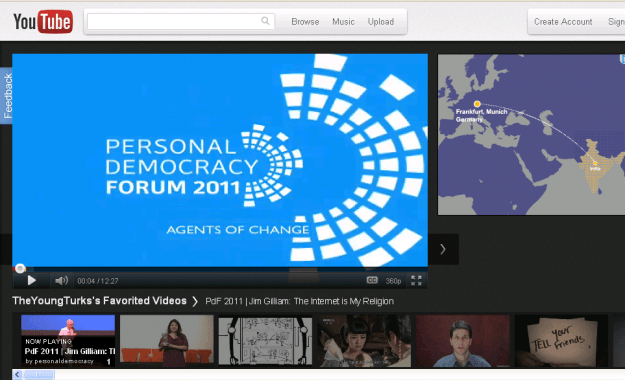
YouTube, having tonnes of videos, are not worried about anything but their design. Right now they are experimenting with various designs. Latest one is YouTube Cosmic Panda. Seriously you’ll love it.
You can expect the following features in the new YouTube,
- A new experience for watching videos and playlists.
- More page designs and better editing tools to customize your channel.
- Keep watching when moving between videos, playlists, and channels (Chrome only).
- Stylish new look and feel.

If you are not interested, you can always go back to the older design by returning to Cosmic Panda and selecting to go back to the “older version.”


thats cool…the new design is awesome 🙂
is it faster than the old one?
should we update YouTube to experience it…….
I didn't liked the new layout. For me I think the older one was much better.
It tried few days, then went back to old layout it became to confusing.
Now that i am using this template for couple of days now i would say its a great one. But as usual change is always difficult to digest.
It get stuck up sometimes to get to my point of thought. Over its a nice change i would say.
Dah after a week or so using it i need to shift back to the older youtube layout. Its not that is not attractive but one always resist change. And i am one of those 😛
I haven't checked the new look of youtube as yet, thanks for informing going to see it now.
Google is changing the look for all their services I think! This one "Cosmic Panda" looks cooool!
Actually it is age of changing and upgrading in every products, so you tube's presentation is much pretty worth. thanks for nice sharing!
The new YouTube design appears cool, however, I wonder what love does Goolge share with the word 'PANDA' 😀
lol really something to think about
makes me scratch my head..lol
you try 😀
Woh! buddy that was great. Is there any specific page where YouTube announces their new templates etc. I love this layout. Google is a real innovation.
<a href="http://bloggingehow.blogspot.com">Blogging Tips For Beginners</a>
this new design is quite elegant…now a days google is focusing a lot on the elegance of its product…gmail,google+,google's homepage n now its youtube..