When you have a website and when it feels like there is something wrong with your website or you see that things don’t look good or proper, if there is a high bounce rate then it maybe a simple problem that can be fixed.
Well, here are some tips that will help you fix these 5 common design flows.
1. Choosing The Right Font

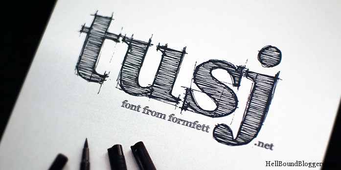
Get the right test for your website can sometimes be a difficult job. The key is to find the text best suiting the mood and look of your website. The text is also an important part of the website as it contributes a great deal to the look and feel of the website. If you are facing such a problem, then you have a simple solution at hand Dafont.com. It is a free resource which users can use to get unique fonts for their respective websites.
Resource : 100+ Resources To Download Excellent Free Fonts
2. Compatible On All The Browsers

Your website should be compatible on all the browsers. As a website owner you might have heard users complaining about your site not working on a particular browser. In such cases you can always use Browsershot.org, this is again a free resource which will check the compatibility of your website in all the browsers. It is very necessary for a website to run on all major browsers. So it is advisable to use this resource to check the compatibility of your website.
Related : BrowserShots – Test Your Site In Popular Browsers
3. Look And Feel Of Your Website

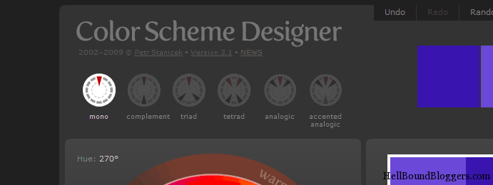
Color schemes is anothor factor that determines the look and feel of your website. So it is necessary to choose your color scheme carefully. If you are not able choose the best suited color scheme then you can use another free resource that will come handy in such situations. Try Colorschemedesigner.com , all you need to do is select the base color and it will give around 20 color schemes to choose from. This will help you to get the best color scheme for your website.
4. Proper Navigation

Next thing you need to see is that your navigation is set up properly. If it’s not properly set up it will create a negative effect on the whole experience the user surfing your website. Well there is no tool to fix it but there are certain guidelines. Set it up in such a way that what is important comes 1st, like your services pages do not put the About us page 2nd in the list after the “Home” tab. Remember a user visiting your website will always be first interested in what services you offer and at what price. So arrange your navigation bar accordingly.
5. Call To Action

Every website has it’s “Call to Action”, make sure that the your call to action is in the front and center of the website and it is also advisable that you have the call to action on almost all the pages of your website. If you have an e-commerce website you can have to the option of putting the call to action after the description of the product. If you want your visitors to call you on phone put your phone number in large font preferably on the header of the website so that it becomes easy for a user to locate your details.
Related : 30+ Tips To Improve Your Website Conversion Rate
Being a web designer, I pointed out these mistakes that will help you to eliminate the commonly found flaws of your website and will help your website in becoming a user friendly and easy to navigate and it will also help your website and you to become successful.


That was quite advantageous data. I'm trying to understand tips on how to style web sites by myself, and this type of website will aid me a great deal in my study.
I think writing to the point things on the home page reduces the possibility of website failure
Proper Navigation in a website design is a very important aspect to work on
Browsershot.org and Colorschemedesigner are great tools to make your blog look great.. I recently came across Colorschemedesigner and it is an awesome tool to decide an impressive look and feel for your web blog..
Good awareness……………..to avoid from loss of web design and in fact to avoid from site degrading.
Best of luck for valuable informations………….!
There is no doubt about this share, awesome
The new theme is really amazing. I find it simple, clear and professionally designed. Keep updating your post. You've done a good job here.
i really liked your new theme , it looks much clean , and simple , though i must say , keep a watch on your loading times
Just suspicion i would criticism as well as contend tidy design, did we formula it yourself? Looks great.
Nicely done and I have to agree with everything. My problem is I used a layout for my site and I want to change the font on the post headers. I don’t know how. Any help?
Thanks
using insights , related posts , navigation bar , etc
interlinking posts , and navigation buttons decrease bounce rate
Thanks for sharing this pretty post.
Usability is a very important point in web design, and design not only because most people like a simple site and easy to understand.
Usability covers all aspects of website design which can be achieved to split testing of LPs too. There is a book named “Landing page optimization” by Tim Ass. A must have read for every designer and webmaster.
Thanks for tips anyways.
Usability, Navigation, Browser compatibility and an intuitive UI — these are the few things that I always look for while evaluating a site/blog design.
I wanna making a plan to design one new blog on health theme. You make my task much easier. You made some good points there. I did a search on web design and web design and found most people will agree with your blog. I bookmarked your blog its really very nice and informative.
Very nice tips, these are very important for website developers to undergo. We must make sure we plan and execute them correctly to avoid future mistakes or problems. 🙂
The biggest error that I see is when people choose black backgrounds and very thin fonts. It makes it impossible to read the content. NO matter how good the content is if I can not read it the blog is pretty much useless.
I agree on two of the above points very strongly – typography/fonts and cross browser compatibility. After developing my own stuff, now I am struggling to make it work in IE 6 though hardly 10-12 visitors per day come from IE6.
Making the website lightweight by design will help a lot as well. Right now DollarShower is just 150KB on the home page 🙂
I believe in following all of those rules. I just can’t accept that people and business owners won’t take the time to upgrade from IE6!
U have shared a good one, i am new in this field and when i make the designed i have faced many problems so i will try to follow the above steps to make it better..
Cheers with Success,
harry
Awesome share,thanks to the author for a wonderful post…
Thanks for sharing the resource, this post will help lots of webdesigner to find a good solution to the 5 common mistakes…
You made some good points there. I did a search on web design and web design and found most people will agree with your blog.
well said 🙂
that’s awesome post !!
nice post!
Very useful post. I’m gonna check out different fonts. Thanks! 🙂
Very true! I agree with all the points here and I want to add one more point here: If the website design is not Search engine friendly, then it may cause a lot of problems.. So it must be kept in mind too..
Thanks, Pradeep. My blog is currently under construction so this post is perfect timing for me.
I think I need to go through your archives also. Thanks for being my blogger friend, it's so cool to know someone with the "answers"…it makes it easier for me. 😉
Nice tips. Your website design should be reader friendly and it should stand out from the crowd.
i found mistakes with my blog…. well nice post…
I try not to use some crappy theme and that solves all my designing needs 😀