What is the most important thing you see when you log in to any blog?
Or, any website for that matter?
Though it would be wrong to say that user interface and user experience are not important, you cannot deny that choice of fonts can make all the difference to the overall personality of the blog and how popular it is among its readers.
Today, we will discuss some simple but oft neglected points which you need to keep in mind while selecting the right font for your blog.
I am often surprised to see bloggers spend huge amounts of money on buying premium themes and expensive plugins but turn a blind eye to this aspect of creating an awesome looking blog.
There are two important decisions you have to take while choosing the font:
- Which font I need to use?
- What font size would look best?
Choosing the Right Font For Your Blog
Easy as it might seem, website owners and bloggers who understand the importance of choosing the right fonts will agree that the choice is not as simple as it might seem at first.
This is because of the huge variety of them that we have to choose from.
Some are free while others are paid.
Some are simple, some are complex.
Then, there are 2 dimensional and 3-d fonts.
Cursive fonts, professional fonts and Graffiti fonts.
The list is unending!!
You have to keep in mind essential parameters like font weight and their loading time as well, since they could affect the loading time of your blog in the long run.
Another thing you just cannot ignore is the legibility or the readability of the fonts you opt for.
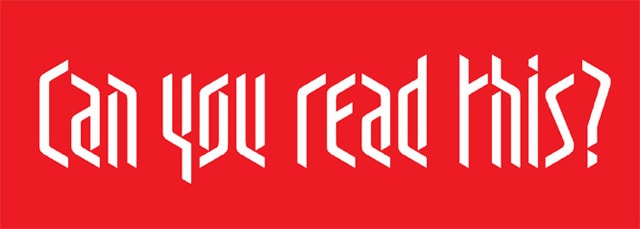
It is useless to choose a very fancy looking, decorative font which would make reading difficult for the visitors and might act as a big turn off.

Font size
After zeroing in the right typeface, it is time to think about the size you would want.
Here, you have to choose more than just the number!
The factors which you need to keep in mind here are the height of thee letters, spacing between them, line distance, spacing between paragraphs an much more.
How to choose?
For those of you who had not given this much of a thought earlier, this might be too much to digest, I am sure.
So, how do you go about choosing the right font for your blog or website?
One thing that you need to keep in mind is that there is no formula that you can use to find out what is best for you.
Things you need to consider
1. Two types of fonts
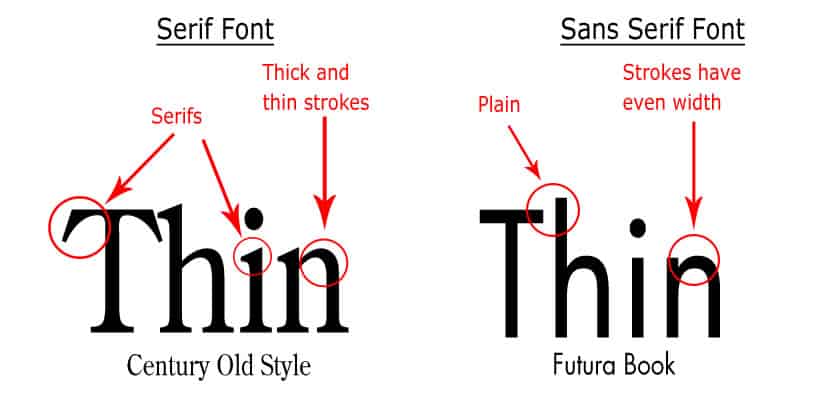
Fonts are basically of two types: serifs and sans serif (without serif).
Serifs are those tiny lines which run across the edges of letters. Hope this picture makes the difference clear:
2. The readability of fonts and their legibility
Do not choose fonts which have too many special decorations to make them stand apart from others, too many offbeat shapes, etc. Have enough space between individual letters so that it is not taxing for the eyes. While bigger fonts can do with tighter spacing, smaller ones need more gap in between.

3. Technicalities
All fonts do not go well with all themes. Make sure that your font is compatible with your theme. Whether the font you want to use is pre installed or you have to download it. If you are downloading a font, make sure to check the completeness of the package to avoid regretting over the wastage of time later.
4. Aesthetic quotient
Last but not the least, you need to keep in mind what impression your font will give and how beautiful and flawless it will look up there.
Now you cannot think of using comic fonts for a tech blog or graffiti fonts for an accountant.
That would look weird and unappealing for obvious reasons.
Conclusion
I don’t want all bloggers reading this post to get up more confused than ever before after reading this post.
All I want to say is that when it comes to the choice of fonts for your blog, the possibilities are endless. YOU have to make sure to choose the perfect one for YOU to make your blog most reader friendly.
It would be well worth the effort if you spend a few minutes and rack your brains to choose what would be best for your readers and you (in that order) to make sure they don’t sign out earlier than they wanted to. And that too with watery eyes and a searing headache!!


I would just say that blogger should choose font style which is both attractive and readable. 🙂
You missed the more interesting thing called Google fonts, install the plugin in wordpress or try some chrome extension so that we can see which fonts suits well. Typography makes people read happily.
I would imagine the cursive and fancy fonts don’t look very professional…so, it depends on the type of blog you have, as well.
Ok. Thanks for suggesting me Yanone Kaffeesatz, Rick.
I was using Verdana for quite some time. And dont quite remember the name of the one I have up there at present. But I am sure it does not look jarring and professional enough too.
Nice input! Fonts are more important than most webmasters think and bad looking fonts can really ruin the impression. I prefer a mix of Arial and a google font called Yanone Kaffeesatz. I think these 2 fonts complement each other well.