Technical sites are usually on the cutting edge when it comes to trendy and gorgeous web design. Because tech companies know the latest innovations, what screen capabilities are and how to engage users, any business can benefit by studying their website designs.

The experts at Deloitte predict edge computing is one of the big tech changes impacting how we run businesses and design websites. They also say artificial intelligence (AI) and cloud computing will remain important factors for the foreseeable future. Edge computing places devices near the source rather than trying to connect to a remote database. Users might use an item containing the data needed or tap into a network closer to their location.
Other changes, such as higher screen resolutions and better cameras, impact design as well. Faster internet speeds and high-quality connectivity mean can better utilize images and animation. We spent a few hours looking at various technical sites to see which ones embrace brilliant design. Here are six examples of elements you should add to your site and images of what you should aspire to.
1. Eye-Catching Headers
Gone are the days of a solid-colored header background or a banner thrown up advertisement style. Today’s headers have a purpose. They help guide the user through a journey toward the page’s goal. They might include navigation, but often are part of a hero image or video taking up the full screen. Designers opt for a more uniform look in today’s headers rather than setting them apart with harsh lines and boxes.
Your header has just as much of a purpose as your navigation or your call-to-action buttons. Done well, they make a first impression on site visitors and draw them further in. Use them to keep people engaged and interested in what you have to offer. Don’t be afraid to try different images, colors and additions. Conduct split testing to see what elements work best with your particular audience.
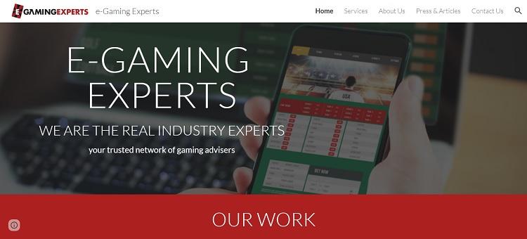
E-Gaming Experts utilizes a more streamlined approach for its header. A hero shot fills the background above the fold. The navigation fades into the top bar but still is accessible, and the focus goes to the typography layered on top of the image. The effect moves the user step-by-step through the phases of the buyer’s journey.
From this website, you can learn the importance of creating a uniform look carrying the user throughout. Create some consistency and make sure the look aligns with other mediums you’re on, such as social media sites.
2. Trust Factors
No matter how innovative your design looks, don’t forget the essential elements creating a memorable user experience (UX). When users land on your page, they don’t always know who you are. They may just be hearing about your company. Use your landing pages to draw them in and show them you are authentic. Include trust factors, such as testimonials, reviews, “about us” information and precise contact info.
If you want people to buy from you and not your competitors, you must give them a reason. What is your unique value proposition (UVP), and are you presenting it clearly to the user? Show them why you’re the best in your field.
If you can’t compete on price, focus on service. If you worry about your service, ramp up the unique options you offer. Study your competitors and figure out what sets you apart, so you can highlight it on your site.
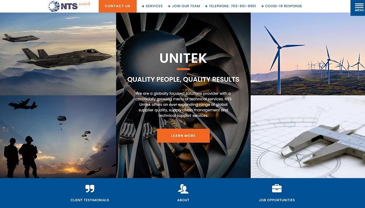
NTS Unitek features several trust factors through its design. A beautiful aesthetic shows it knows how to be professional. It then adds to the effect by including customer testimonials on its home page. Users see how the company has helped others like them and what they love about the brand. It also links to the about page above the fold, so it’s easy to find information about the organization.
Keep important information above the fold. Be open and transparent, so users see you are trustworthy. Think about what details you’d need to make up your mind as a consumer. Perhaps you should add a review section or specifications. Does the customer understand your satisfaction guarantee?
Think through each phase of the buyer’s journey and what you need to explain in that phase to move the consumer to the next level.
3. Strong Copy
Great design includes a place for strong copy. The goal of a website is to inform customers and convert them from visitors to leads. The best way to do this is by figuring out what their pain points are and then answering related questions via articles, infographics or videos. The more helpful you are, the more you’ll set your brand apart as an expert in the field. Great design is a combination of the way a site looks and how usable it is for the target audience.
Strong copy includes details the consumer most wants. You may need to ask some questions to figure out what to feature. You should also pay careful attention to headlines and make sure each word counts and clearly outlines what the page or section is about.
Your body text is your chance to go into greater detail. People tend to skim over large blocks of text, so break up crucial points with bullets, bold some phrases or otherwise set vital points apart. Make your pages easy to read and visually appealing.

Carter Logistics uses the latest technology to deliver results. It focuses on facts by presenting how many shipments it’s completed and how many countries it operates in. It also explains what sets the company apart from others.
Consider what images and icons best match each feature or benefit of your product or service for your site design. If people glance down your page, do they get the gist of what you bring to the table? If anything seems difficult to understand, simplify it. Use elements such as infographics and tables to break things down and give visual cues.
4. Uncluttered Design
Excellent design starts by cutting unneeded elements. You should think about your target audience and the page’s purpose. How do your goals meet their needs? Once you understand this, it becomes easier to cut anything not moving users toward that goal. Every word, image and call to action (CTA) should tie back to your page’s objective.
Whether you’re just starting a new site or you already have one you’re revamping, begin by cutting out as much as you can. You can always create a separate landing page if you need to tell more about another topic. Each page should have a specific focus, though.
What is the most important objective? What do you want the customer to do when they land on your website? How can you encourage the action? Pour over the page and cut anything not matching your goals.
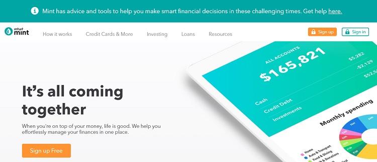
Intuit Mint helps people keep track of their personal finances. Everything on the page points to that purpose. The image is of a phone pulling up the software, so someone can track their accounts. The headline and subheading explain how the company can help you manage your finances in one place. It then has a CTA where you can sign up for free and start using the software.
Use a mix of images, text and CTAs to explain what you provide. Keep the phrases short. Don’t delve into complex topics better saved for a demo, video or white paper.
5. No-Nonsense Forms
Users don’t want to spend hours sharing every tiny detail of their lives and business. If you make your forms too long, you risk them bouncing away to another provider who will give them the same service without requiring so much information.
Think about what you truly need to provide customers with excellent service. What are must-haves for demos? Can you collect more details at a later time? Keep your signups simple and to the point. You want to entice people into using your software or service, so they can see how amazing it is.
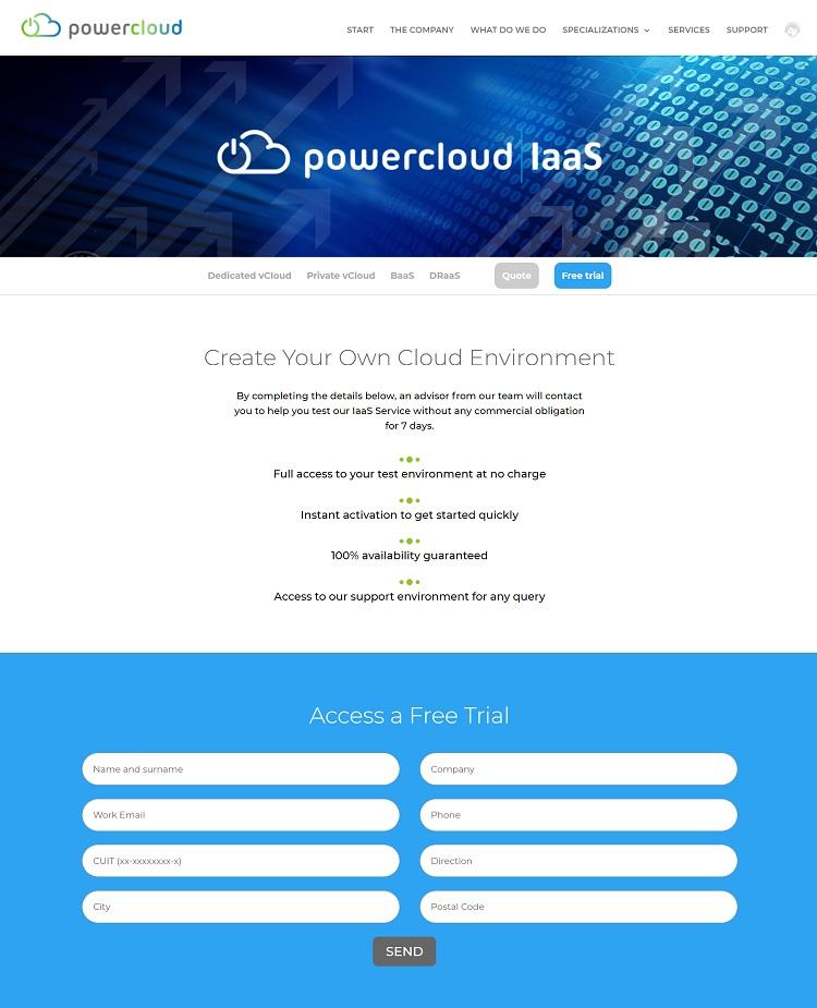
Powercloud provides cloud computing services to business owners. The signup form to download a free demo is short, collecting only what the user must have. The fields’ size is large and easy to navigate between boxes, even on a mobile device, keeping the site user-friendly and mobile-ready.
The information you collect could also fall under rules such as the General Data Protection Regulation (GDPR). Only collect and store necessary info. You certainly don’t want to be fined for violating basic rules when you can easily avoid such a scenario.
6. Explainer Videos
Now that most people have faster internet via fiber optic cables or 5G, more web designers include videos in their designs. According to experts, 83% of marketers believe they help with lead generation. They are easier to absorb, fun to watch and engage the user. Including explainer videos on your website adds another level to your presentation.
Those who only have a few extra minutes to figure out how your product works may find videos particularly appealing. The human brain processes images must faster than text. Providing explainer videos also cuts through the clutter.
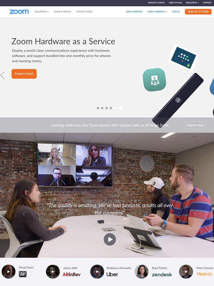
Zoom utilizes videos to highlight how the software works. You can see the communication tool in action as someone taps into a meeting in a coffee shop and a board room. Adding video to your design brings your product to life for people looking for specific features.
- Benefits of Smarter Design
Pulling modern elements into your design shows users you understand the technological changes and proves your business is on top of things. You can benefit by providing a better customer experience. You’ll also have one of the best-designed sites in your industry. Start by studying what your competitors do, move to looking at some of the designs winning awards and finish by coming up with your own website features making the most sense for your users.
Lexie is a digital nomad and graphic designer. If she’s not traveling to various parts of the country, you can find her at the local flea markets or hiking with her goldendoodle. Check out her design blog, Design Roast, and connect with her on Twitter @lexieludesigner.