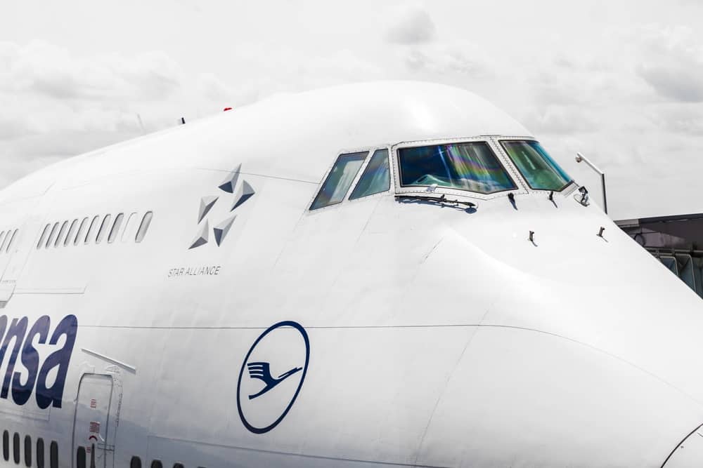
Aside from the existence of common branding elements – logo, brand name, and guidelines – each industry comes with its specs. An airline logo will always lay on both sides of the communication, whether it’s mainly digital or analog. These logos still stand out on the brands’ social media pages and airplanes. They integrate with online geolocated campaigns and stand as design pieces of personnel’s clothing.
The Lufthansa Airline logo was first designed in 1918, so this year it celebrates a hundred years of existence. The emblem had undergone some slight updates until the beginning of 2018 when it was part of a rebranding campaign.
Evolution of an airline logo: The Lufthansa case study
Lufthansa’s current logo contains a crane symbol and the company’s name. Both are shown in dark-blue on a white background. The color and font are essential and mostly remained unchanged over time. There are plenty of resources available to help you discover what made designers choose bold and dark blue. However, if you check this article, you can also see what influenced or inspired Lufthansa branding managers to make specific choices.
Another airline company compiled the first version of the signature logo in 1918. Lufthansa’s founders purchased the logo and the company in 1926 and used the logo as its own. The brand’s version of the logo hand elongated tail and head and a curved body compared with today’s logo. Lufthansa shortened the silhouette and gave it a more geometric design. Moreover, the crane was placed in a rectangle, as opposed to its original circle. The first update occurred in the 1960s when the airline logo returned to its signature circle. You can have a look at creative free plane logo designs for inspiration.
Lufthansa’s preferred colors were dark blue, gold and white – out of which the bright gold disappeared due to the latest update. The airline has a German company it never forgets about, so it always used fonts that resemble Helvetica and Normal-Grotesk. Letter are straight capitals. The latest logo version contains a bolded font than the previous ones.
Meaning of the Lufthansa logo
Otto Firle is the author of the original Lufthansa logo. The designer is now among the top specialists that marketers look up to. Given the times when the airline appeared, the crane bird symbol placed on an airplane had a deeper meaning than today. Back then, such a logo symbolized the power of planes to fly as efficient as birds. Today, the iconic crane sends a premium message regarding the company’s services.
By the way, Hansa means crane in German, while Luft means air. The meaning behind the brand’s name is clear and straightforward for Germans, while those from other countries can see it as complex, yet easy to remember. The crane bird also symbolizes good luck, stability, and strength. Hansa is also the abbreviation for a medieval trading group called the Hanseatic League.
Five branding lessons any airline logo should write down
Given the above facts, the 2018 logo update featuring the removal of yellow raised intense debate among graphic designers and marketers. Expert Robert Lisovskiy designed the current version of the logo. He became famous after created the symbol of radical Organization of Ukrainian Nationalists. Let’s check which of these might work for your brand!
1. Build a cult, not a brand
Any airline is above all a service provider. It might contain products – such as travels to specific destinations at certain times – and means to offer them as are airplanes. The Lufthansa logo is visible together with the wordmark or in its absence. By splitting the logo in two, the company managed to improve the regular appearance of the airline, adding them a stylish value.
However, branding goes beyond the logo. Lufthansa managed to create a brand which focused on its clients, instead of its products or services. Flying with an airplane accomplished the traveler’s dreams to see the world. The wish to fly would be the core point of Lufthansa which even released printed versions of ads back in the days. The ads targeted both families who planned to travel as much as possible and flight enthusiasts who wanted to become pilots.
Building a cult instead of a brand targets more areas such as brand loyalty and brand recognition. Satisfied customers are long-lasting and useful sources of word-of-mouth marketing. The cult constructed around your brand helps it become more popular even than its products/services. By creating experiences out of products/services, you send out a coherent message that strengthens your connection with customers. Other said it helps you build a killer brand, instead of a killer product/service.
2. Make a priority out of consistency
An airline logo needs to stand out among others literally. The audience should instantly recognize it when placed next to other logos in real life situations – such as waiting at the airport for the plane to arrive. Throughout its activity years, Lufthansa hasn’t wholly changed its logo at all. All the updates were slight adjustments which either bolded the circle, moved the focus to another color, or improves the margins of the crane bird.
Brand consistency makes your logo recognizable in all circumstances. Most adjustments aren’t usually visible for the end customer. However, if an update causes an emblem to be unrecognizable, the change involves an adaptation period that buyers must go through and an entirely different branding campaign.
The Lufthansa airline logo is one of the proofs that branding can be improved far from the eye of end customers. While graphic designers notice any change, buyers receive a coherent message from your brand.
3. Initiate a rebranding campaign
Whenever a line of products expands, customers usually receive it as improvements. However, if a brand has more product lines, they cause unnecessary headaches. Keeping more product lines under the umbrella of a single brand might become confusing for the end customers.
Lufthansa’s latest logo update occurred as a rebranding campaign initiated to update the essential elements of the company. The company released its rebranding campaign together with other factors, including the design of the personnel’s outfit design and explanations about the change. Lufthansa wanted its message to become even more premium and update to times. If millennials would be the company’s next customers, then the news should fit them. In-house designer Ronal Wild handled the rebranding task.
Start rebranding from the top down and ask why such an initiative would be necessary. It may have educational purposes, sending a more explicit message or targeting a wider audience. Either way, rebranding should follow the path induced by the initial branding campaign and only necessary target changes to elements. The rebranding campaign of Lufthansa was minimal to its logo. Interventions were calculated and focused on sending an even more simple and straightforward message.
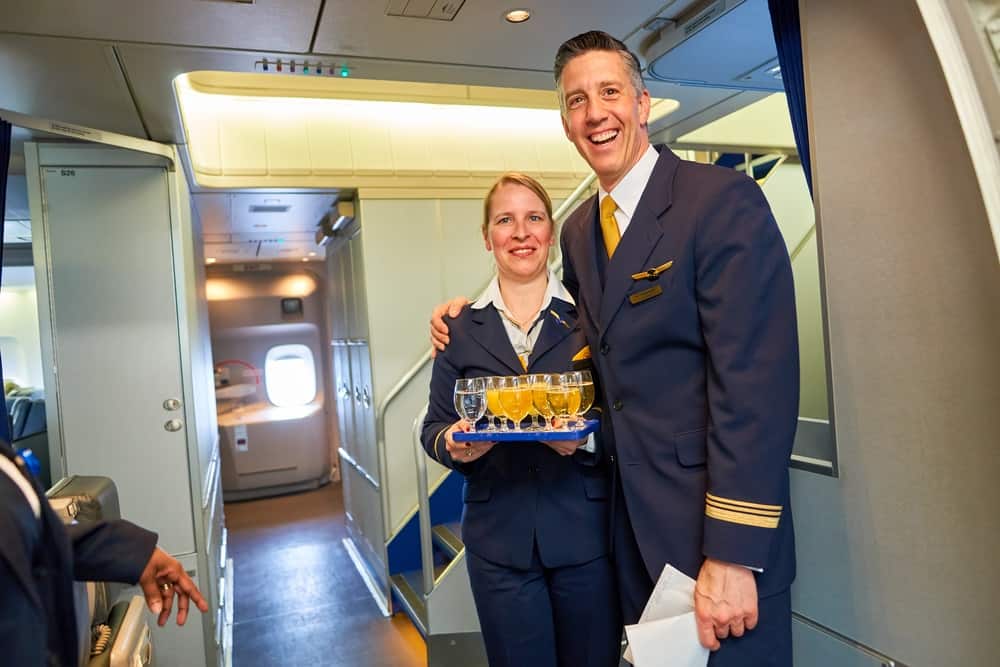
Lufthansa managed to raise discussions by eliminating yellow from planes. Some influencers noticed that airline brands might begin to look the same as there’s no intense color to differentiate them. Yet, this elimination allowed the airline to also adjust its visuals and user experience to small smartphone and smartwatch screen. The yellow is still visible on personnel’s outfit.
4. Don’t get into debates
Marketers were expecting a significant change to the airline logo. However, it only featured adjustments and the removal of gold or yellow as a background. The move has been subject to so many discussions that it even generated press articles about the importance of specific colors in a design. Lufthansa’s presentation prevented a debate with graphic designers by explaining why brand leaders have chosen the changes.
Whenever a strong brand initiates a campaign, it generates reactions. Responding them (unless necessary, of course) begins a discussion which might draw attention from your campaigns or initiatives. Official brand responses lead to chain reactions from the press and specialized websites.
Rebranding campaigns and officially announced logo updates are usually followed by campaigns that promote the new logo and the changes. Engaging in a discussion regarding the variations will confuse the end who accidentally get involved in the campaign. Since responses and accusations mostly involve branding experts, they have low chances to obtain good reactions.
There’s been a debate about the new Lufthansa airline logo. Experts stated that the change was too dull, and the emblem lost some of its charms when it gave up on its signature yellow. However, the color was no longer necessary in the context of turning into a premium service provider.
5. Cover the entire customer journey map
Lufthansa already has the reputation of a high-end company which provides its audience with premium service and products. There was just a matter of time until the company would rebrand and respond to the audience’s demand to visually reflect its quality. However, rebranding didn’t stop here. Lufthansa improved the customer experience by also enhancing its customer service department which already had positive feedback.
The customer journey map or user experience involves a coherence between the airline logo and all of the other elements that connect the user to your brand. Each step of the buying and usage process should be covered. That’s why Lufthansa has insignificant complains regarding its customer support.
Attention to details can boost or lower a brand’s popularity. An airline logo campaign cannot go through the same creativity as mainstream retail or food brands can. However, there’s a lot you can synchronize a rebranding idea with. Lufthansa decided to reveal the logo update when the brand turned 100 years. Having such a moment to connect with your campaign increases its impact and the emotional side of your brand.
What else matters aside from a fresh airline logo?
Sticking to your brand’s message in almost mandatory for an airline with a reputation to protect. Our today case study has initiated an environmental campaign with long-term partner NABU (Naturschutzbund Deutschland e.V.). Lufthansa gets involved in the protection of endangered bird species – the crane, of course. The airline initiated such campaigns in the 1980s and continued to do so by announcing each new initiative. Such an idea increases the strength of a brand’s core values and consideration towards them.
Some campaigns also need to connect with your services. The airline announced its rebranding campaign with #LufthansaBlue. It was an educational campaign that targeted those who want to know more about the company and what lies behind the scenes of the color-change initiative.
Lufthansa offers more than the possibility to fly to new destinations. It’s about the experience of flight and travel. That’s why the airline supports its long-term campaign #SayYestotheWorld and promotes it based on a geographic criterion. In March 2018, the campaign entered India two ways.
One side of the campaign showed locals that the airline is More Indian than you think by introducing local cuisine, hospitality and entertainment services to tradition-oriented locals.
Meanwhile, millennials were encouraged to explore the world, discover new sites and wonders and have an open mind regarding what travel can offer them.
The two-in-one campaign carries the fame of its correspondent ideas from other countries. While it’s still ongoing, we might say it has high chances to increase Lufthansa’s sales in India.
Wrapping Up
Lufthansa is a global airline company which remains among the top ten of its kind for years. Brand managers know what they need to promote and focus on. Its services are flawless, and so the logo should be. Even though Lufthansa may seem to have disappointed a side of the public with the latest logo update, those who had negative responses might not be the airline’s buyers, but rather a section of the vast audience who enjoys seeing colorful logos.
An airline logo needs to look appealing on digital and analog form, on personnel’s outfit and – above all – in the sky. As a travel service provider, Lufthansa emphasized its premium side and lifted its standards regarding design. This is a lesson to learn from. In the end, an airline logo might never go through radical changes without raising questions in customers’ minds. However, it can and should closely communicate to what the company itself has to offer.
Images Source: Depositphotos.com.